Find food fast with Taste, an image-forward restaurant review app with tweet-length reviews.
Background
This project was for an intensive UX101 class with New York Code Academy. I chose the project topic area after repeatedly experiencing frustration with Yelp restaurant reviews. The work demonstrated in this post is a combination of research from the class and more recent design work. I’ve learned a lot since taking this summer course a year ago and some of my previous design decisions didn’t make as much sense with fresh eyes.
I did maintain the following directions from user feedback in the redesign for this portfolio post:
Images are more important than words
Reviews should be short and scannable
Ratings should have context
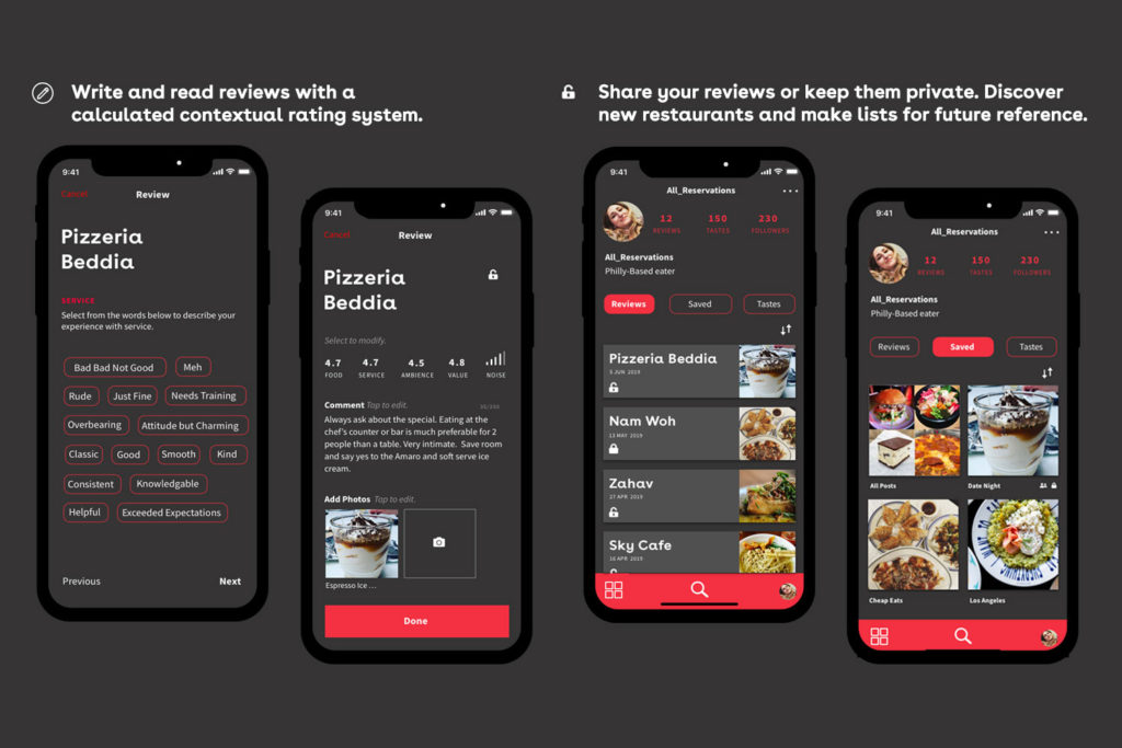
There is a desire to save and share reviews
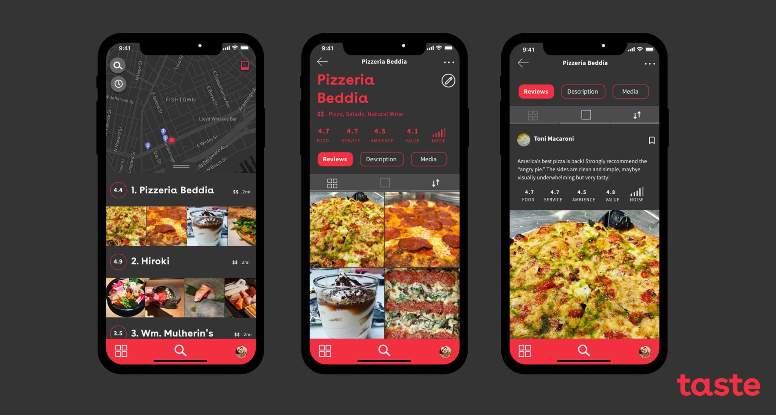
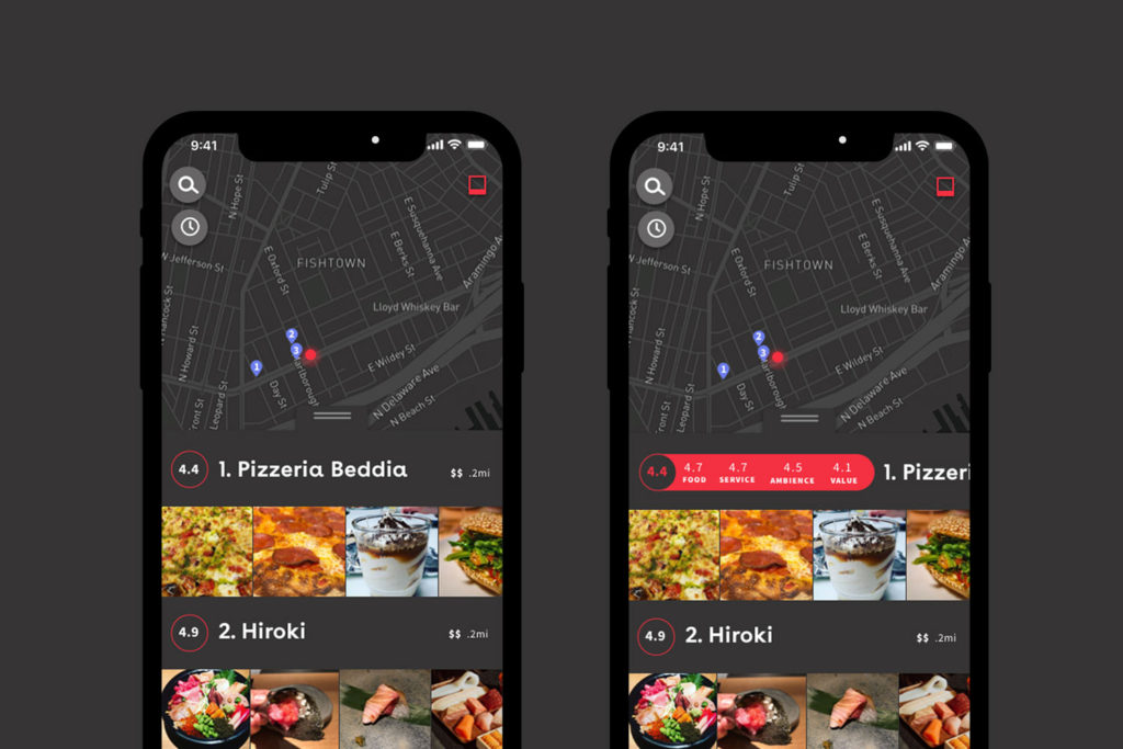
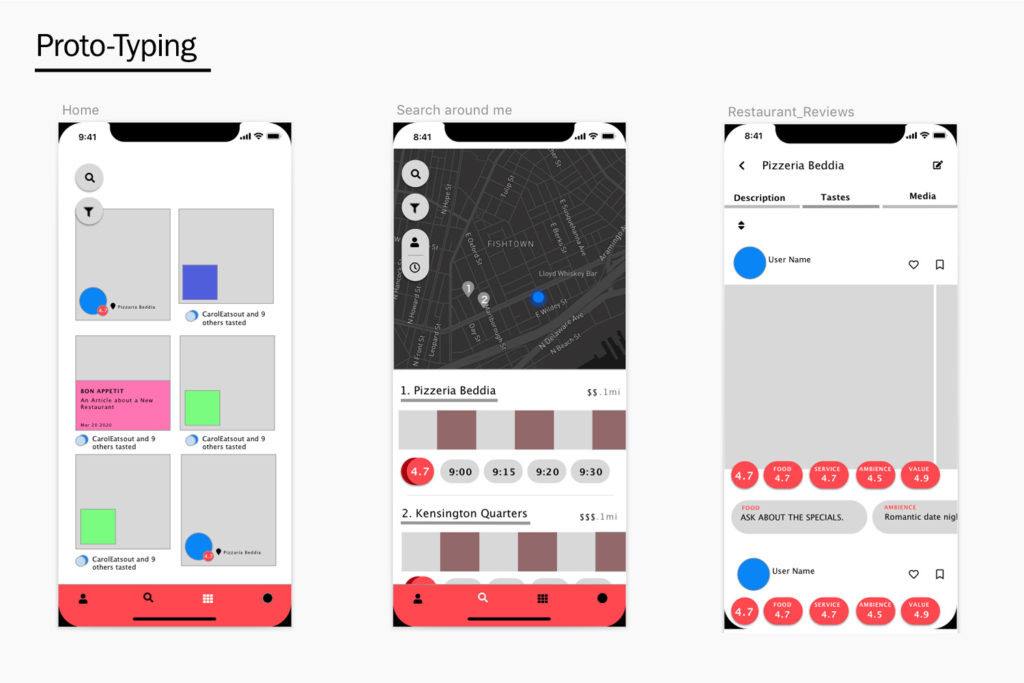
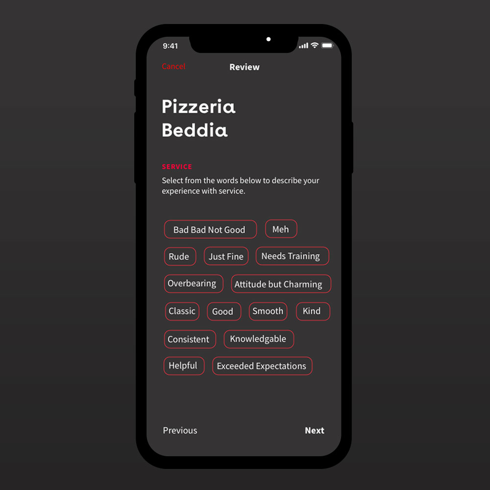
After user testing and feedback in which users stressed images over the review rating, I deemphasized the parsed review on the main search results page. By allowing the parsed review to share a line with the restaurant name, popping out only when the user seeks that info, more search results can fit on a screen. Difficult to demonstrate in a prototype: Each restaurant has a carousel of images pulled from reviews.
Above Pop-out, parsed review
Above Reviews and user home
Above A fun feature that allows users to immediately find the closest, bestest pizza.
Interviewing Eaters
To solidify my understanding of the problem, and make sure it was a real problem and not my own bias, I interviewed several subjects. I developed the following hunt statement to keep me on track as I asked interviewed potential users to gain background on individual eating habits, learn about their information gathering habits and sources, as well as how the factors that go in to their decision making processes when it comes to food.
HUNT STATEMENT
To understand dining-out related information gathering and decision making of “cuisine-obsessed” individuals: the how, why, what, when, and process of this type of eater’s choice of where to go, what to order and when.
“I want to see good pictures and save them. I would love to be able make lists of places where you want to go and what to order in a future city, share it with fellow travelers.”
Lisa G.
“It’s annoying that the first 3 results on Yelp are always ads and it just feels like you’re skimming and scrolling through a lot of pointless commentary before you find what you’re looking for.”
John O.
“People have different qualifiers for “the best” restaurants. We recently went to a well reviewed place that ended up being way too expensive and we found the service over-bearing. So disappointing.“
Adrienne M.
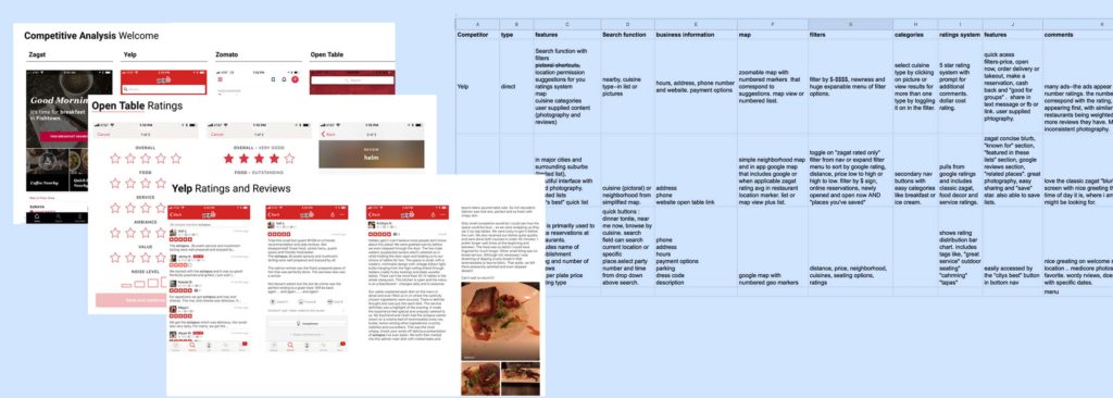
Competitive Analysis
I looked at direct competitors like Yelp, Zagat, and Zomato and indirect competitors like Open Table. I kept a spreadsheet of commonalities and a presentation of screencaps of how each competitor executed various features and functions. Because my user was interested in a visual representation of content, I also looked at Pinterest and Instagram to learn any lessons on visual organization that they had to offer.
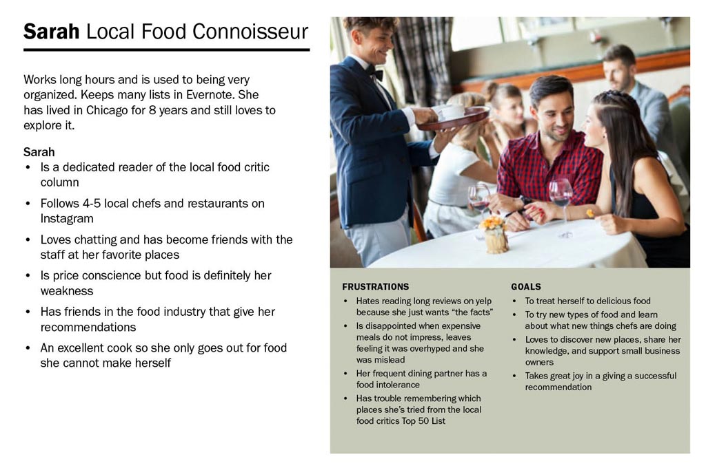
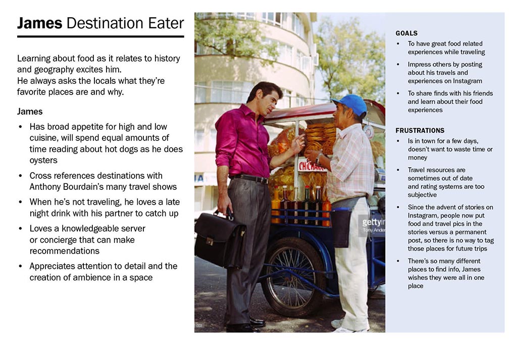
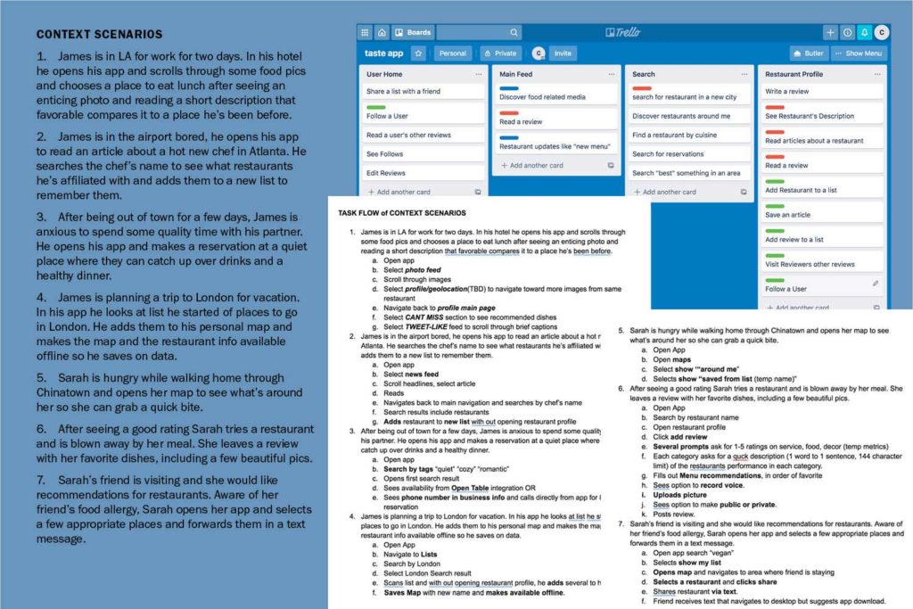
Developing Personas, Context Scenarios, and Task Flows
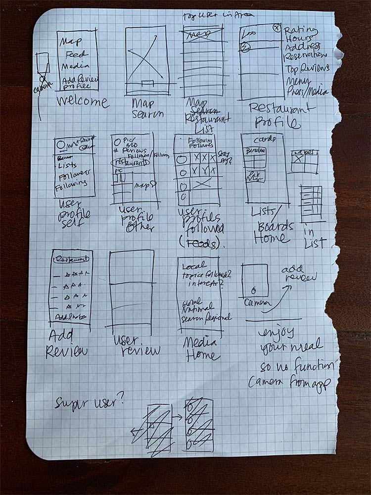
Task flows helped me begin to roughly visualize what features screens might contain, their relationships to one another, and what visual patterns the user might begin to expect. With those patterns in mind, I sketched a few essential screens on paper.
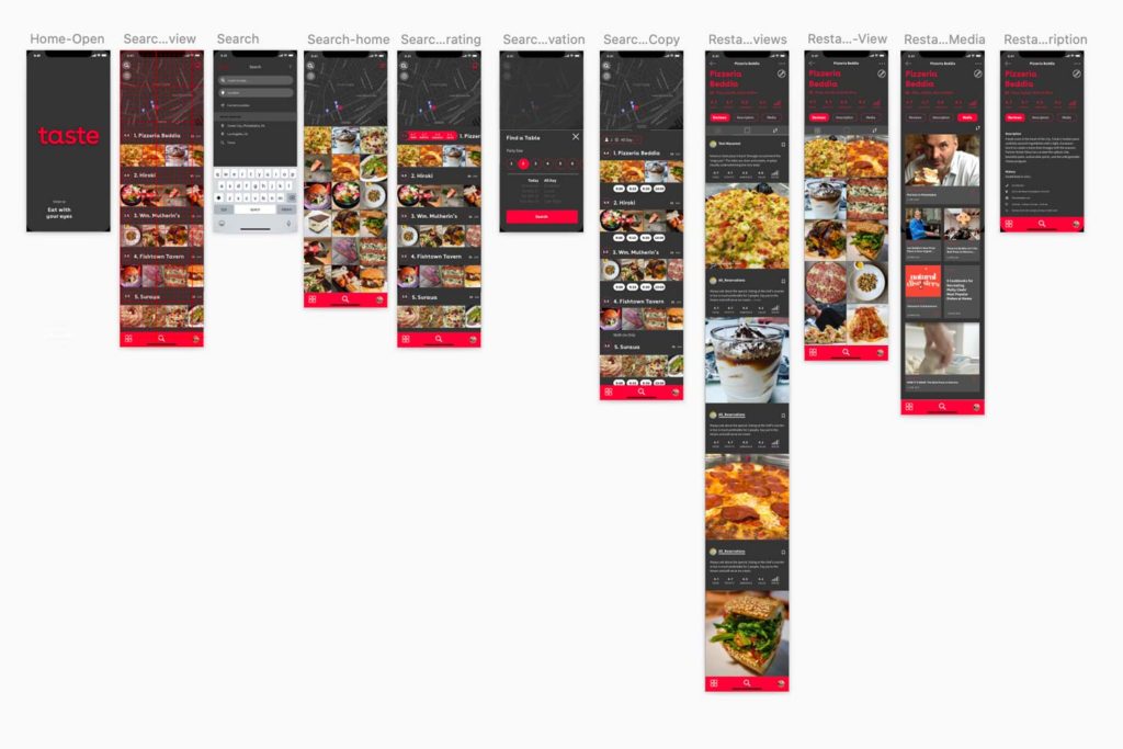
Lo-Fi Wireframes, IA, and Prototyping
Task Flows helped me begin to roughly visualize what features screens might contain, their relationships to one another, and what the visual patterns the user may begin to expect.
To the Drawing Board: Atomic Detour
This is a portfolio project. I want it to look nice. Nicer than the user tested version that I made when I was originally assigned the project for class. A year after my class, I restarted this project at this point of visualization to learn a few things that made me nervous: Sketch Libraries and component design.
Process
Adding Interface Design
I chose a dark mode view for my anti-yelp customer. (It felt classier!) I mirrored competitors with the usage of red for a the primary color.
There's Always Room for Improvement
So much to think about! I really struggled with trying to find the line between visual design and user experience in early prototypes–it’s easy to get caught up in imagining a design move and then playing it out across screens. I’d really like to learn more about how working ux designers toe that line, especially while maintaining an “atomic” system that is unique to that project.