KieranTimberlake put the passive cooling strategies of their new building to the test over the course of two hot and humid Philadelphia summers. In order to monitor and improve the well-being of their employees, they developed a comfort survey which combined with data from over 400 sensors.
Original Survey
For our first summer of monitoring, the research group’s summer intern set up the simple survey site to capture information about user’s comfort including how they feel, their location, and the clothes they’re wearing. The survey included drop down menus with pre-selected wardrobe combinations and their associated R values in parentheses. The R value is important in determining the insulation provided by each individual’s clothing. Users select how they feel, whether or not their desk fan is on, and type in additional comments. After submitting, users are rewarded with a historical fact and are able to view the results of the survey by comfort level and by location.
Round 1
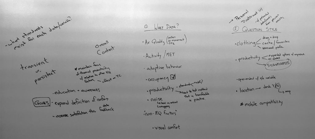
For the second summer, the research group wanted to improve the survey. Their primary goal was still to use the survey to gather feedback on comfort in the office to increase satisfaction in the office. In addition to collecting data on thermal comfort, they wanted to know about humidity, air quality, and noise pollution one might experience along with the associated impact on productivity and they also wanted to educate the employees by expanding their understanding of factors contributing to comfort.
They white-boarded their goals and needs for the new survey and asked if I, the communications graphic designer, would like to “take a pass” at a desktop and mobile version.
The goal of this round was to present a digital sketch to the team and gauge whether we had a common understanding of the problem. I also had the opportunity as a user to suggest improvements and daylight issues.
Questions and Observations
Clothing selection is limited
Does user need to see or understand R value of clothing items?
The “one this date” factoid is a motivator to complete the survey and is frequently shared among users
Levels of comfort are not contextualized
Survey is aesthetically sterile
Suggestions
Icon based clothing selection
Icon based-color coded thermal comfort representations with the ability to select contextual info
An interactive word of the day reward, to boost office participation. (This is a clever bunch that appreciates such a challenge)
WIREFRAMES
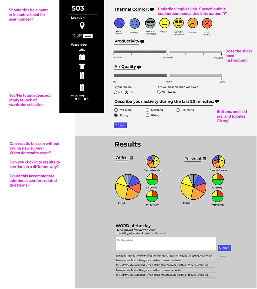
My original desktop and mobile wireframes are below. The comments in magenta are my critique after revisiting this project. At the time of the project, the research group found it to be too simplistic. The client is interested in a more sophisticated interface and wants the user to understand the selection criteria of their choices, so frowny faces aren’t going to cut it!
I went back to the drawing board with an appropriate mobile screen size for a “fit test” of real content and advice to read up on important heuristics like “visibility of system status” and “user control/freedom”.
This work was done in Adobe Illustrator, before I learned about Sketch and component libraries.
Desktop Survey Wireframe, Version 1
Mobile Survey Wireframe, version 1
Round 2, or "How I Learned UX Was a Thing"
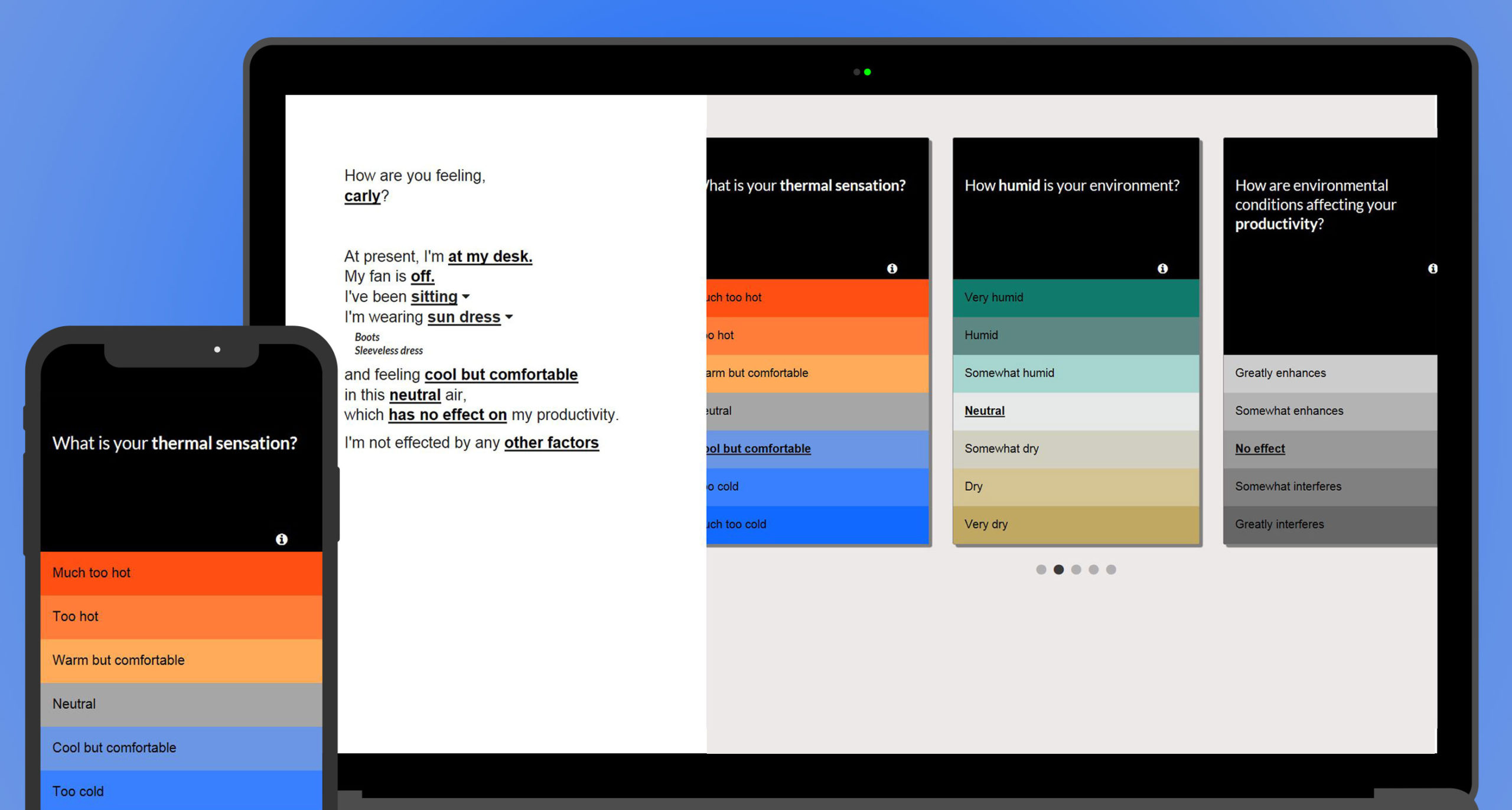
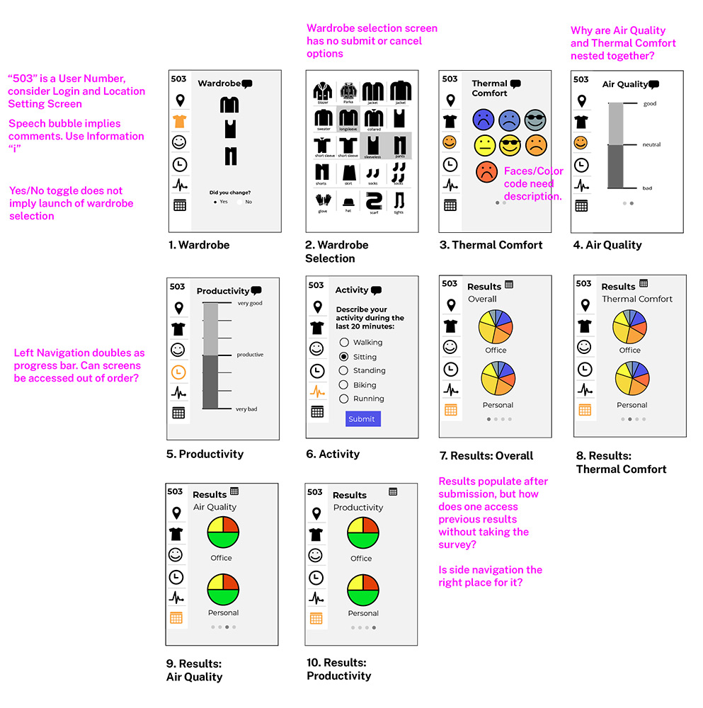
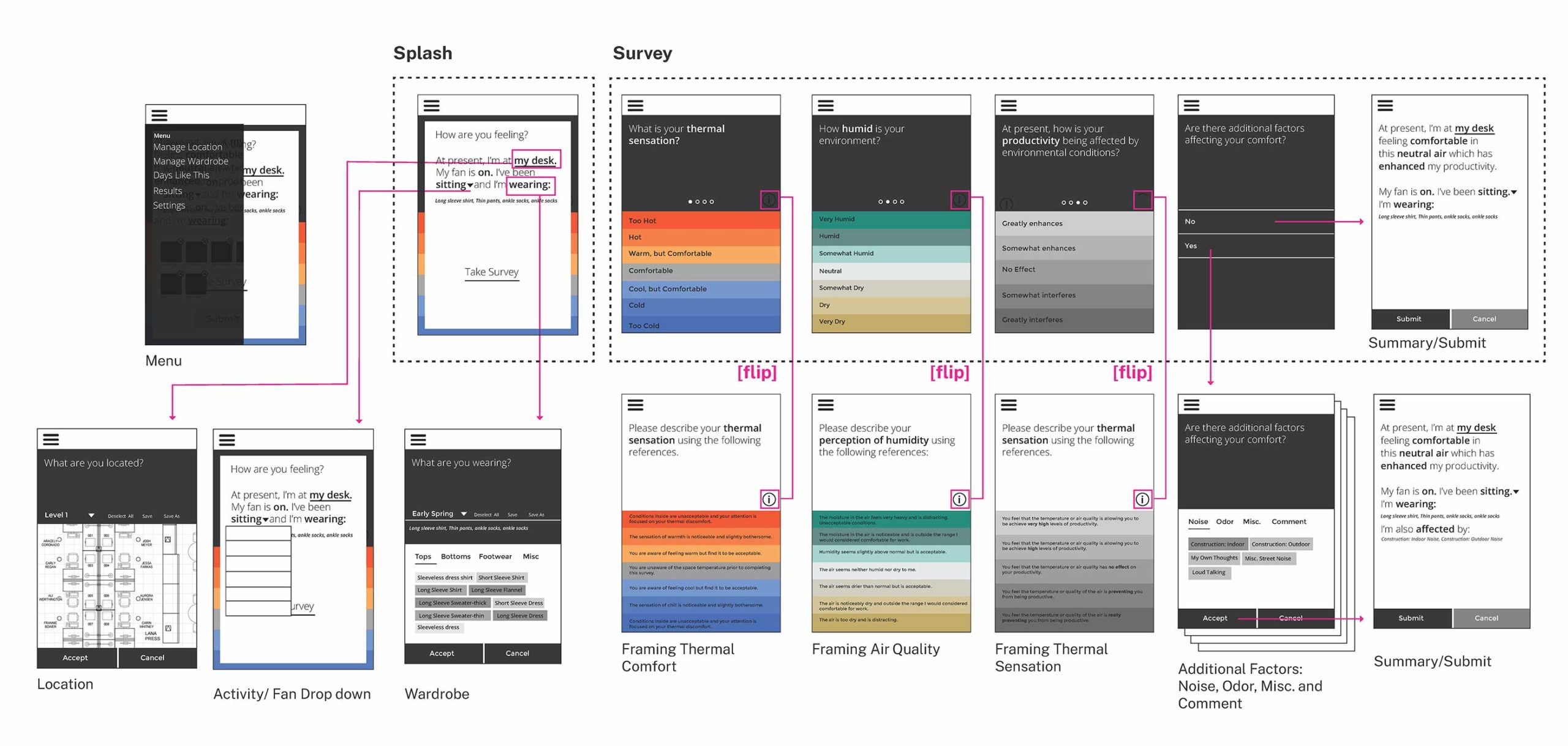
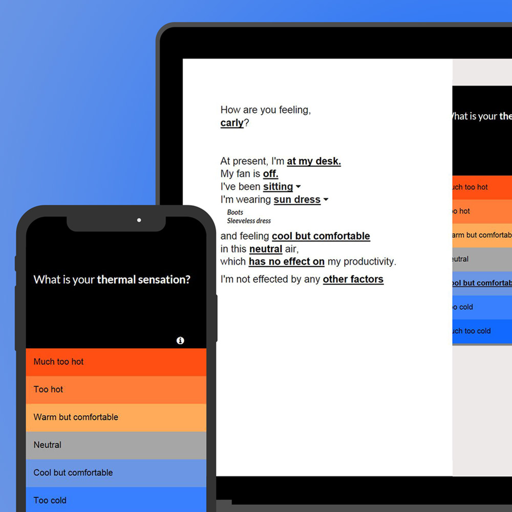
In a few days, I returned to the team with some sketches of pages based on “cards,” which were very hot in 2015 UI. I retained some colors from the original survey but held a place for expanded contextual info under an “i” button (barely visible in the export below.)
I had the idea to start the survey with a mad-libs style paragraph that would be filled in with the user’s selections. I tried to keep language friendly and empathetic where there was an opportunity.
I made an effort to keep the visual language of selections consistent and give the user an idea of their progress in the survey.
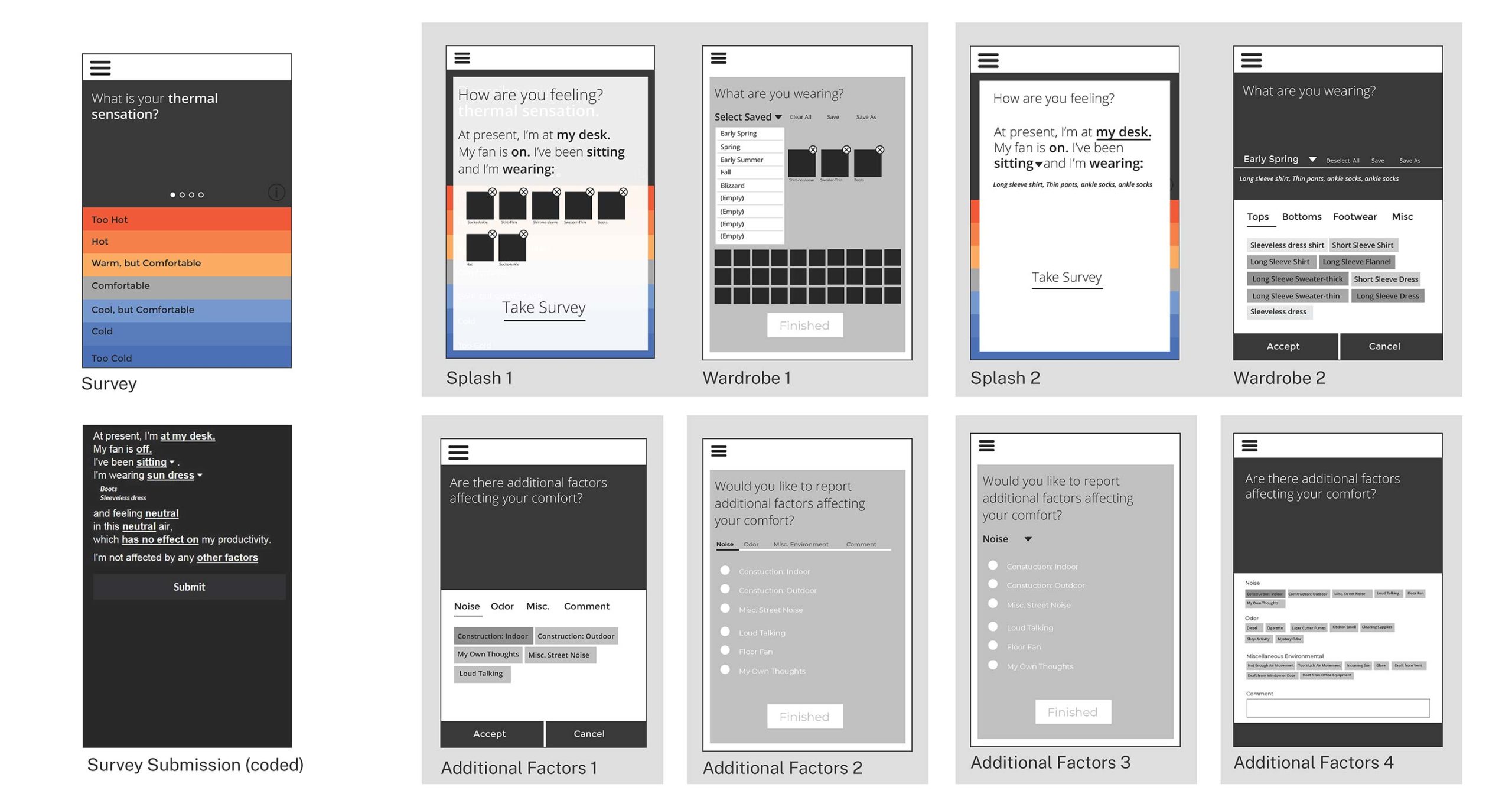
Below are screen shots of iterations of design patterns and user flow of the survey screens.
Design Patterns
User Flow
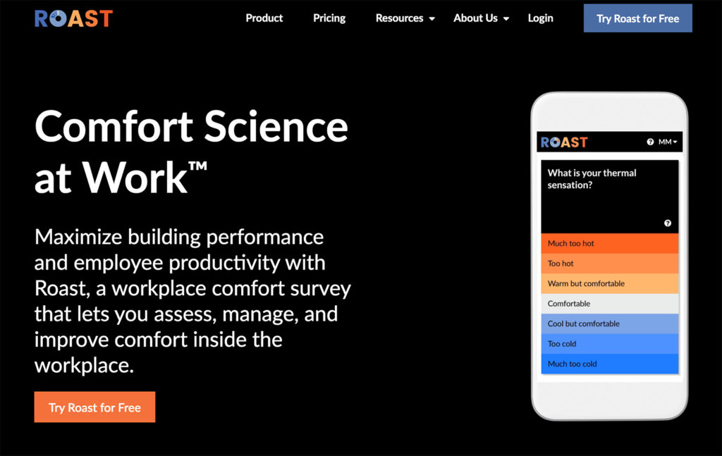
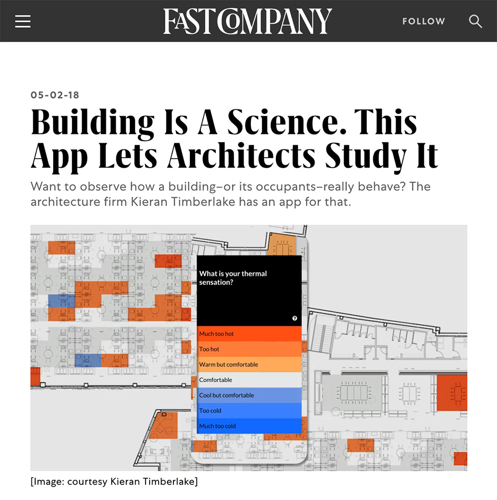
Thermal Comfort Survey Becomes ROAST
KieranTimberlake gathered over 10,000 survey responses in the first two summers of the survey.
The survey, combined with their sensor data, helped KieranTimberlake drastically reduce the amount of energy a building their size typically uses to ensure the comfort of their employees. The thermal comfort survey laid the foundation for ROAST, an application that can help record and improve how people use spaces.
Many of my original design decisions remain in the user-tested final product. Learn more about Roast and KieranTimberlake’s experiment in the links below.